Savor Group
2023Shenzhen
○ Branding
○ Logo Design
○ Merch Design
○ Creative Production
Brand concept
Savor Group represents refinement in the world of food and beverage. Based in Shenzhen, each establishment under this umbrella is a testament to culinary mastery, where dining is an immersive experience.
Logo design
At the heart of Savor Group's brand identity is a meticulously designed logo featuring the intertwined initials "S" and "G," representing the group's name. This elegant serif font lends a timeless quality to the logo, while the silver and dark blue color palette exudes a sense of prestige. The intertwined letters create a visual unity, reflecting the seamless integration of diverse culinary offerings within the group.
Color palette
In crafting the visual identity for Savor Group, we have chosen a palette of silver and dark blue. These regal tones evoke a sense of luxury and sophistication, reflecting the group's commitment to providing an elevated dining experience. The interplay of silver and dark blue creates a harmonious balance, symbolizing the group's pursuit of excellence.


Terra Madre
2023Shenzhen
○ Branding
○ Logo Design
○ Menu Design
○ Uniform Design
○ Merch Design
○ Package Design
○ Brand Consultant
Brand concept
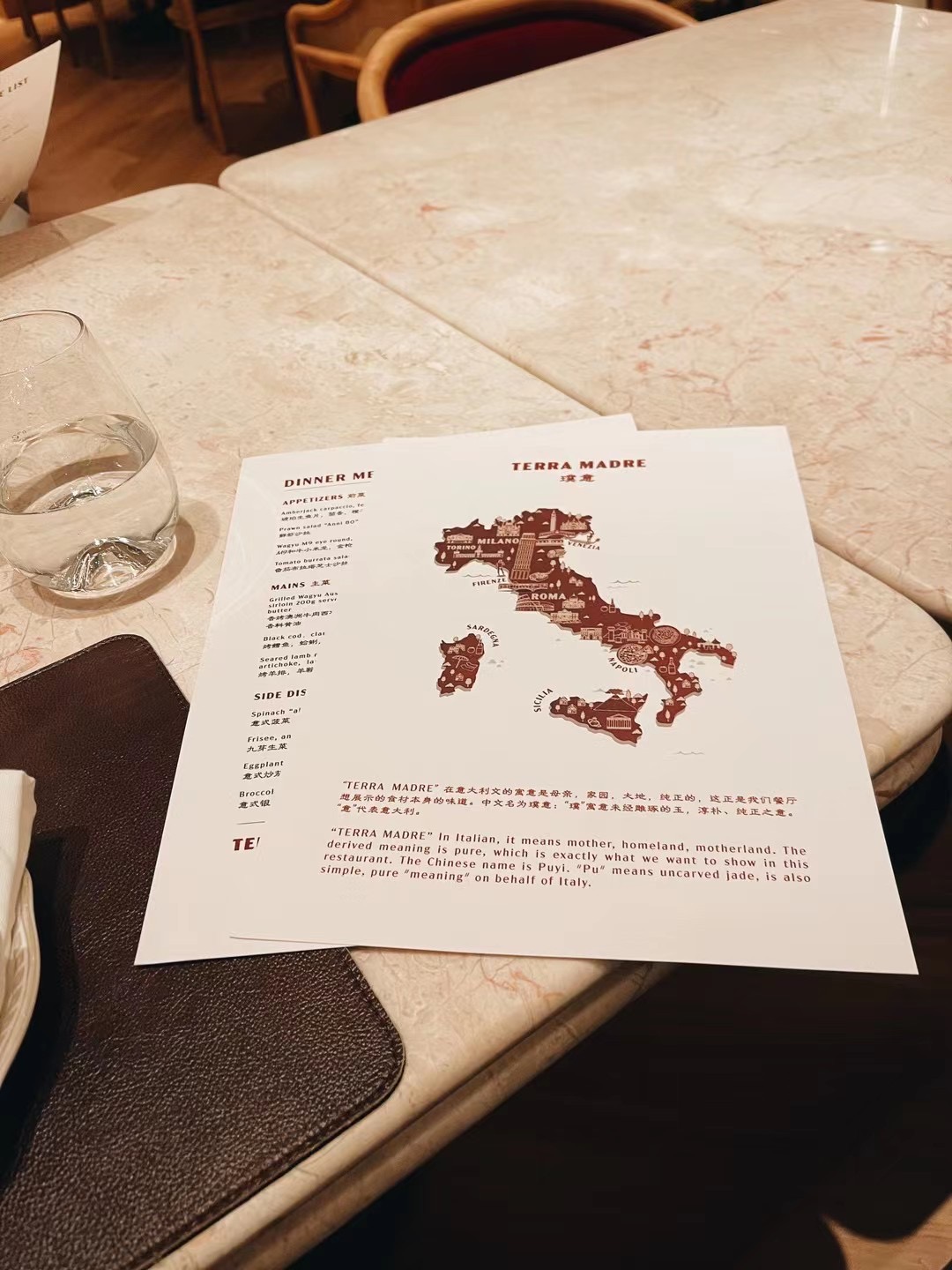
Terra Madre is not just a restaurant; it's a celebration of the essence of Italian cuisine, a journey that brings the soulful traditions of "Mother Earth" to your table. Our brand essence revolves around authenticity, warmth, and a deep-rooted connection to the rich tapestry of Italian culinary heritage.
Logo design
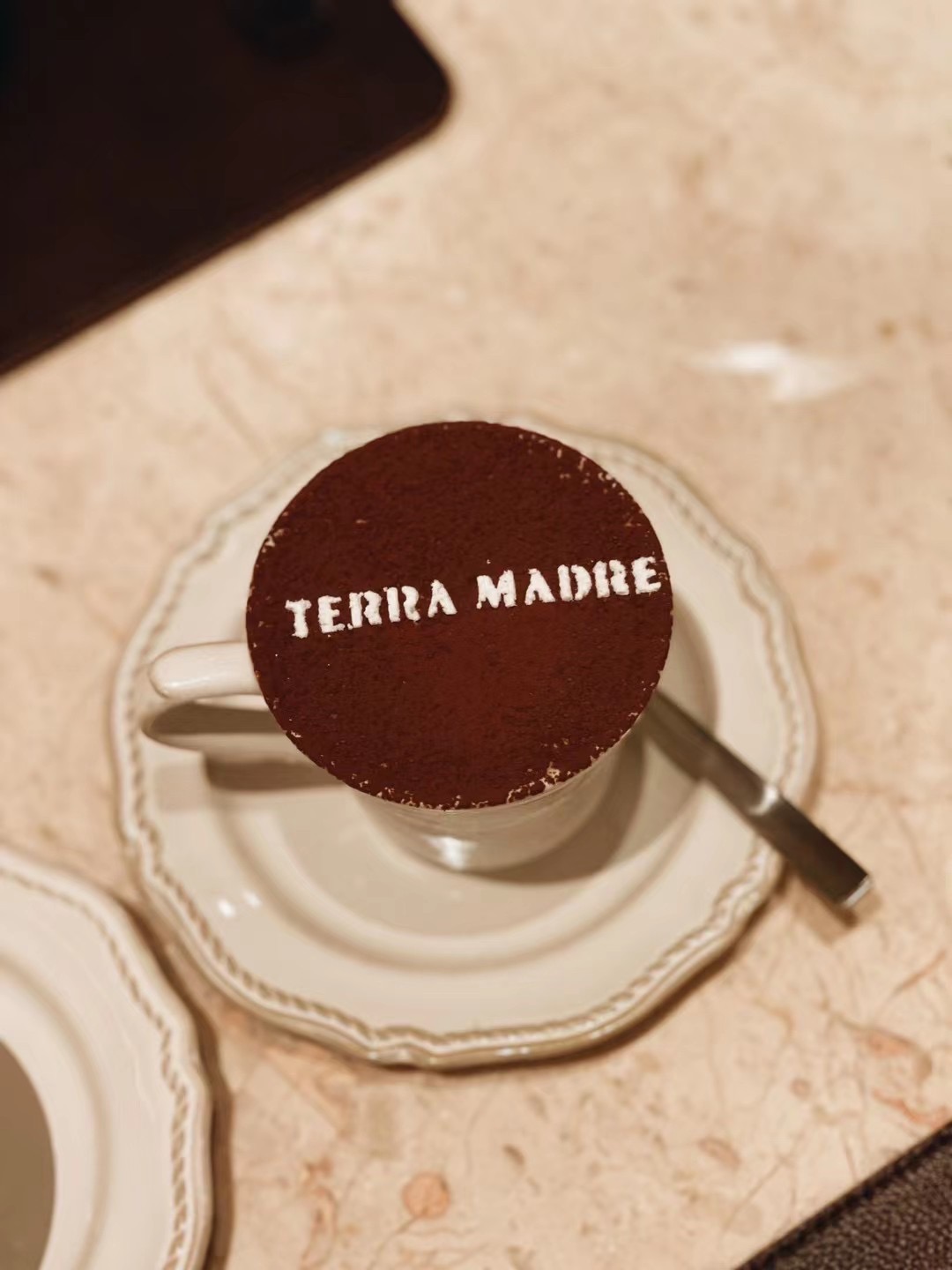
The Terra Madre logo is a nod to the charm of traditional Italian restaurant signage. The chosen font, with its customized rough edges, adds a touch of patina and authenticity, symbolizing the restaurant's commitment to time-honored culinary craftsmanship. The rustic yet refined typography create a visual narrative that transports patrons to the heart of Italy, where every dish is a story, and every meal is a celebration.
Color palette
Drawing inspiration from the heart of Italian gastronomy, we've curated a color palette that mirrors the hues of freshly made pasta and the deep richness of wine. A light beige reminiscent of al dente pasta sets the stage, while a bold burgundy red, echoing the tones of fine Italian wines, adds a touch of indulgence. The combination creates a visual symphony that evokes the sensory delights of dining in an authentic Italian refined trattoria.