Chickadee
2019Shenzhen
○ Branding
○ Logo Design
○ Menu Design
○ Package Design
○ Photo Shooting
○ Scene Setup
Brand concept
Step into Chickadee, where authenticity is the main ingredient, and every bite is a proof to genuine craftsmanship. This is more than a culinary adventure; it's a journey into the heart of tradition and passion.
Logo design
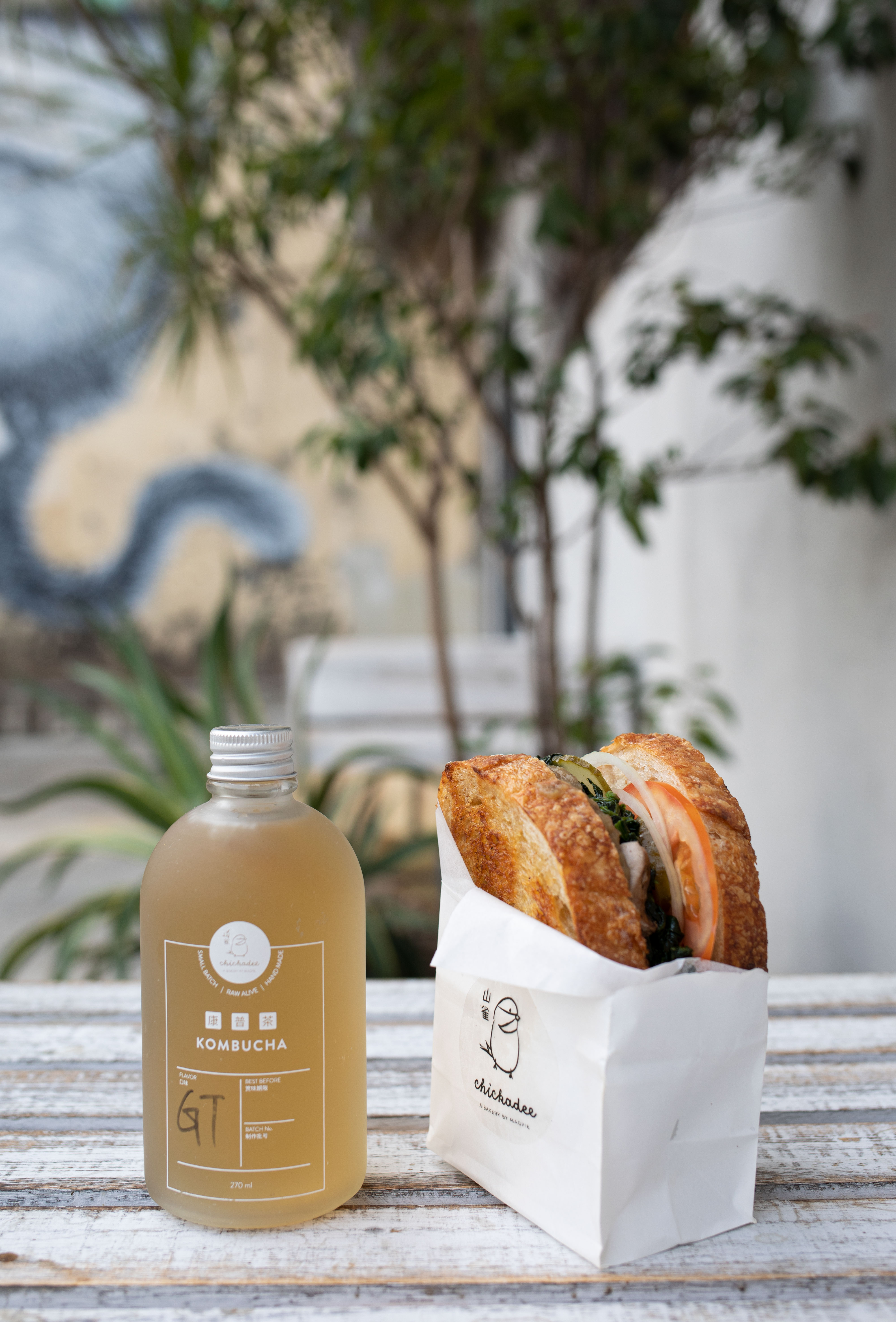
Chickadee is owned by Magpie group, an F&B group that has venues named after birds. Hence, at the core of our visual identity lies a hand-drawn bird, a symbol of authenticity and comfort. The bird is a crafted expression of the bakery's dedication to delivering an experience that feels personal, like a cherished family recipe. The soft curves and detailed strokes evoke a sense of warmth, while the bird signifies the freedom to savor traditional delights.
Color palette
Drawing inspiration from the warm tones of nature, we've curated a palette of comforting beige and rich brown. These earthy hues embody the warmth of freshly baked goods, creating a visual symphony that resonates with the bakery's commitment to quality.


