cream story
可丽牧
2023
Shenzhen
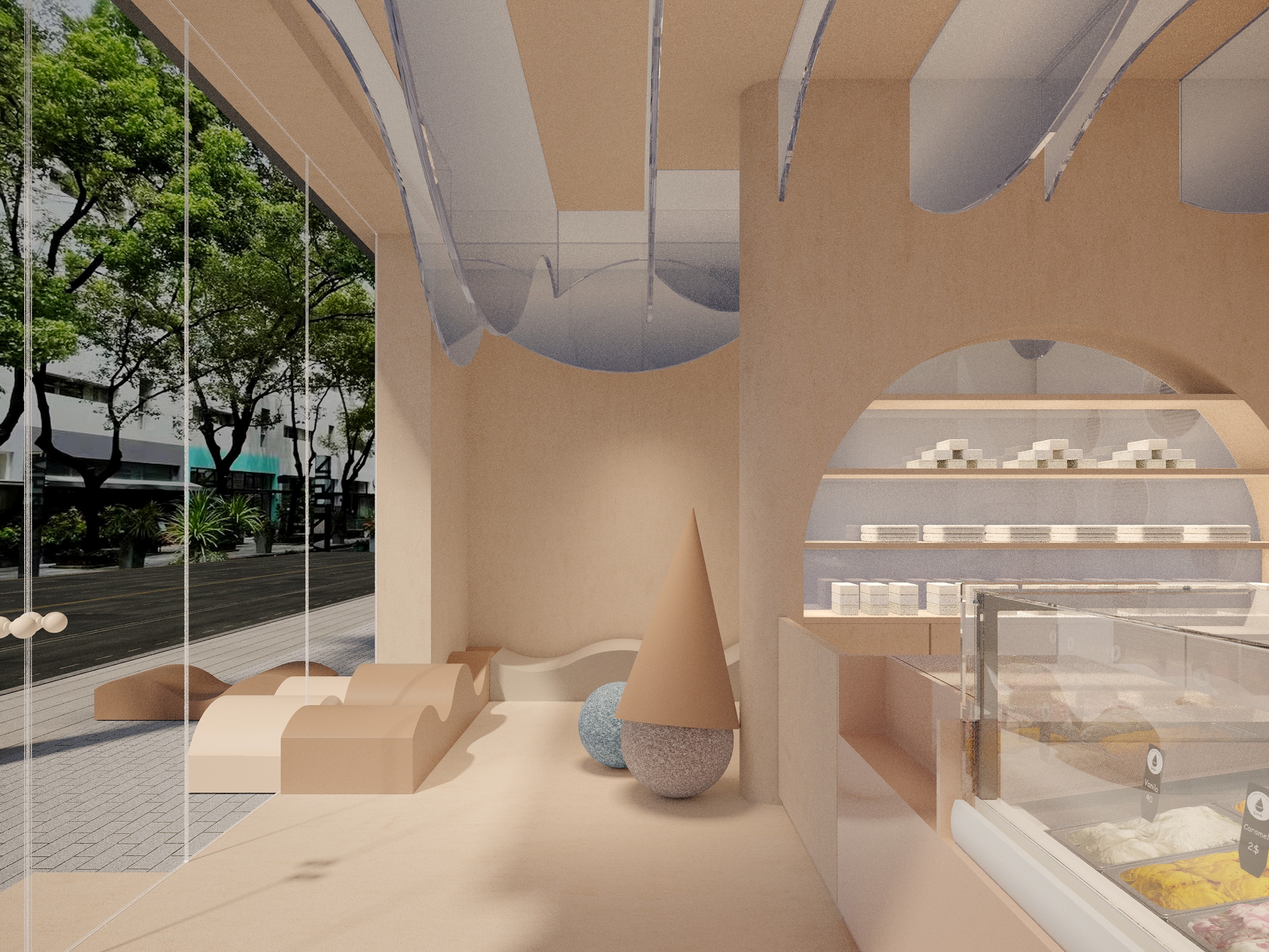
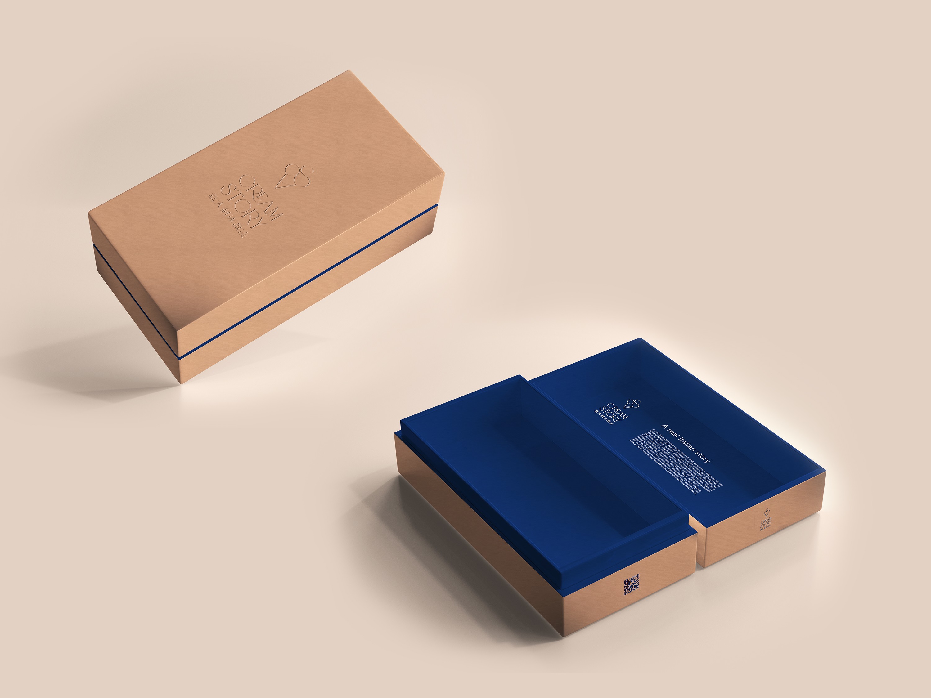
Cream Story is an Italian gelato brand that achieved remarkable success, selling over 100,000 scoops in its first month. The brand combines artisanal craftsmanship with meticulous attention to detail, offering a high-quality gelato experience. Its collaboration with Milanese brand VESTRI adds an extra layer of sophistication and craftsmanship to the brand’s identity.
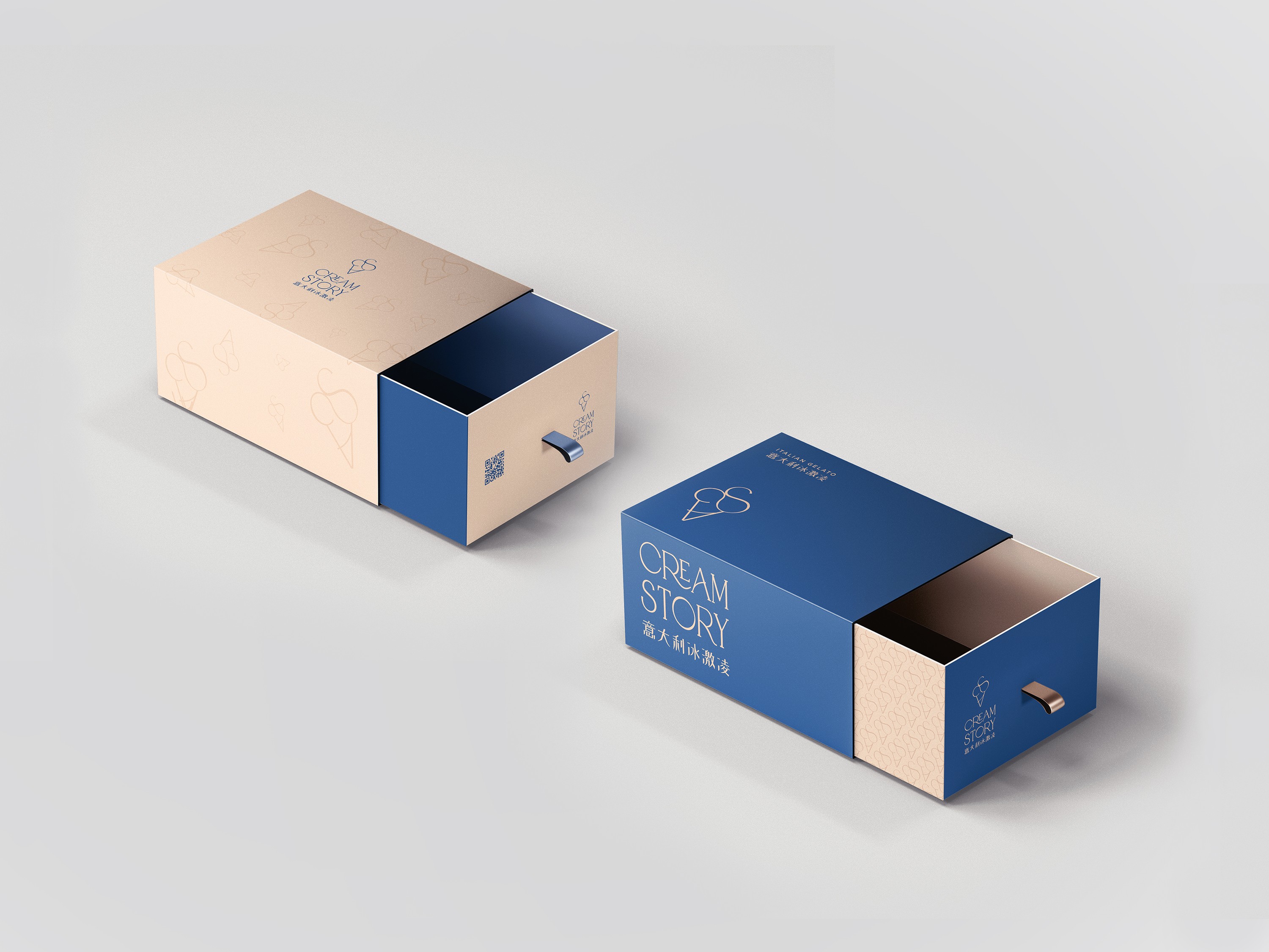
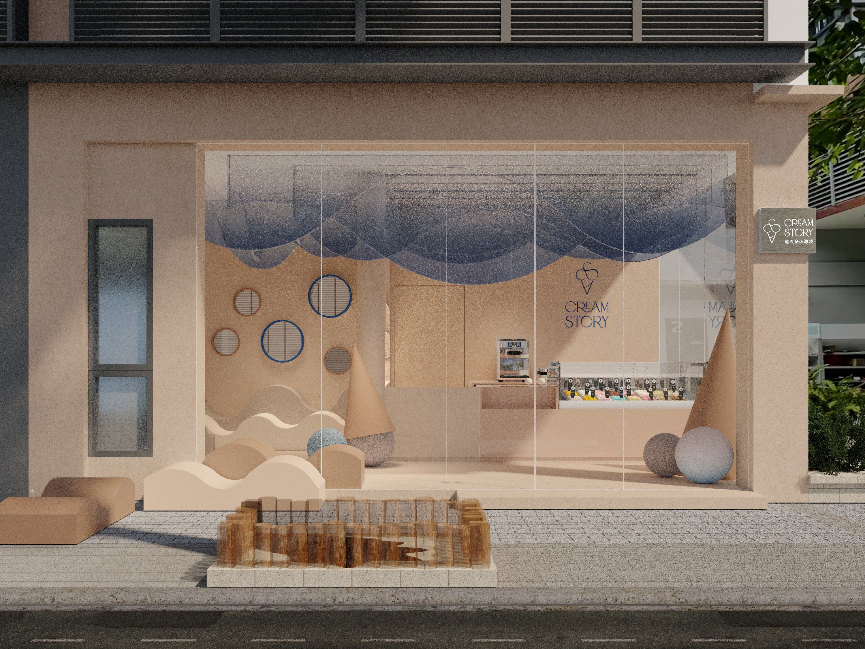
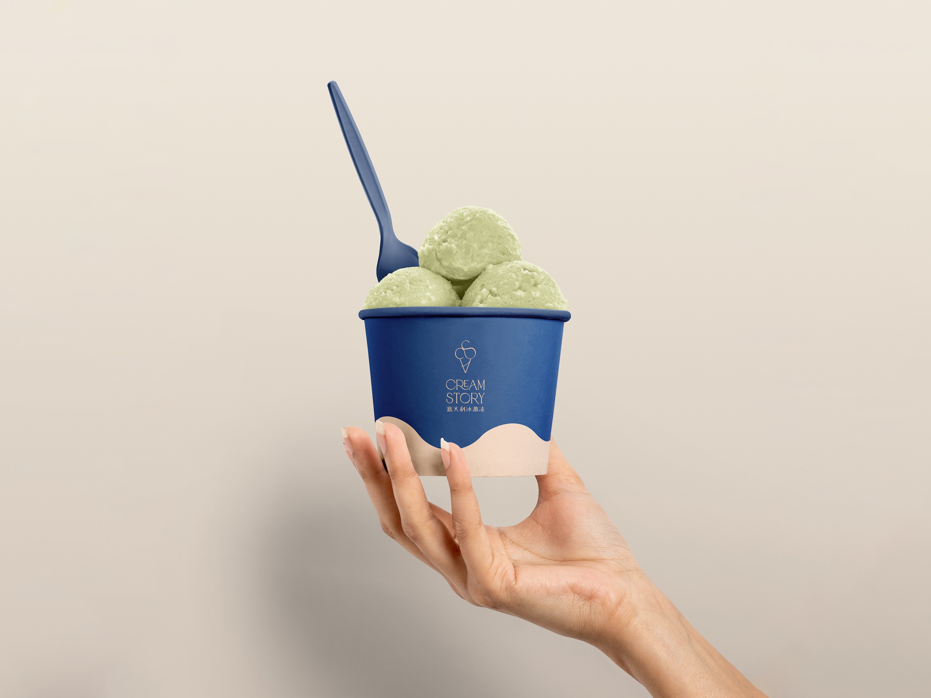
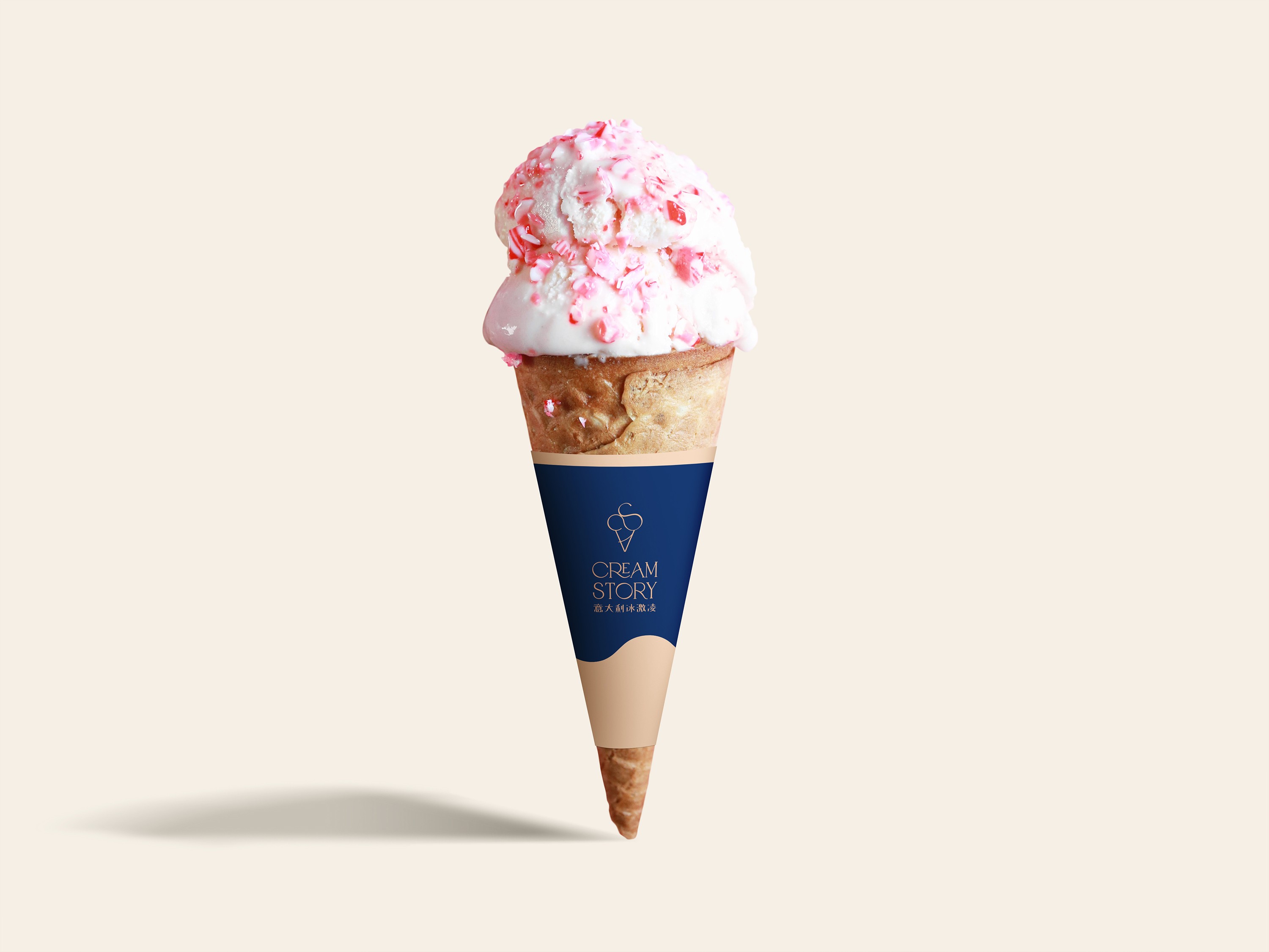
The visual identity focuses on minimalism and modernity, using clean tones and refined details to make each scoop a visual work of art. This elevates Cream Story’s recognition in the high-end market, positioning it as a leader in the premium ice cream culture, appealing to both young customers and upscale partnerships.
Cream Story 是一家意式冰淇淋品牌,在市场上引起了热烈反响,首月便售出了超过 10 万球冰淇淋。品牌的核心理念是将意式手工冰淇淋的精湛技艺与细腻的细节雕刻结合,为消费者带来一种高品质的冰淇淋体验。此次与米兰品牌VESTRI 的联名,更是加强了品牌的工艺感和高端氛围。
Cream Story 的品牌视觉系统在设计上追求极简与现代感,强调纯净的色调与精致的工艺感,使每一款冰淇淋都不仅仅是味觉上的享受,更是视觉上的艺术品。品牌的形象不仅提升了它在高端市场中的辨识度,也为吸引大宗订单和高端合作打开了更多机会。Cream Story 正在重新定义年轻人对冰淇淋文化的认知,以清爽而不失奢华感的态度打造冰淇淋的新风潮。
inquiries
中国大陆 Mainland China
bella@wearepanglossian.com
中东/亚太地区 Middle East, Asia Pacific
matteo@wearepanglossian.com
欧洲/美洲 Europe, Americas
benedetta@wearepanglossian.com
our houses
深圳 Shenzhen
4th Floor, Building 15, Honghuayuan Village, No.38, Honghua Road, Nanshan District, Shenzhen
香港 Hong Kong
Unit D 23/F Centre Mark II, 305-313 Queen's Rd Central, Hong Kong
威尼斯 Venice
Calle Seconda de la Fava, 5990, Venezia
© 2025 PANGLOSSIAN STUDIO.
All Rights Reserved.
cream story
可丽牧
2023
Shenzhen
Cream Story is an Italian gelato brand that achieved remarkable success, selling over 100,000 scoops in its first month. The brand combines artisanal craftsmanship with meticulous attention to detail, offering a high-quality gelato experience. Its collaboration with Milanese brand VESTRI adds an extra layer of sophistication and craftsmanship to the brand’s identity.
The visual identity focuses on minimalism and modernity, using clean tones and refined details to make each scoop a visual work of art. This elevates Cream Story’s recognition in the high-end market, positioning it as a leader in the premium ice cream culture, appealing to both young customers and upscale partnerships.
Cream Story 是一家意式冰淇淋品牌,在市场上引起了热烈反响,首月便售出了超过 10 万球冰淇淋。品牌的核心理念是将意式手工冰淇淋的精湛技艺与细腻的细节雕刻结合,为消费者带来一种高品质的冰淇淋体验。此次与米兰品牌VESTRI 的联名,更是加强了品牌的工艺感和高端氛围。
Cream Story 的品牌视觉系统在设计上追求极简与现代感,强调纯净的色调与精致的工艺感,使每一款冰淇淋都不仅仅是味觉上的享受,更是视觉上的艺术品。品牌的形象不仅提升了它在高端市场中的辨识度,也为吸引大宗订单和高端合作打开了更多机会。Cream Story 正在重新定义年轻人对冰淇淋文化的认知,以清爽而不失奢华感的态度打造冰淇淋的新风潮。


inquiries
中国大陆 Mainland China
bella@wearepanglossian.com
中东/亚太地区 Middle East, Asia Pacific
matteo@wearepanglossian.com
欧洲/美洲 Europe, Americas
benedetta@wearepanglossian.com
our houses
深圳 Shenzhen
4th Floor, Building 15, Honghuayuan Village, No.38, Honghua Road, Nanshan District, Shenzhen
香港 Hong Kong
Unit D 23/F Centre Mark II, 305-313 Queen's Rd Central, Hong Kong
威尼斯 Venice
Calle Seconda de la Fava, 5990, Venezia
© 2025 PANGLOSSIAN STUDIO.
All Rights Reserved.